Difference between revisions of "Magic User Interface Programming"
From MorphOS Library
(Added a link to subarticle.) |
(Some grammar fixes and changed the word 'completed' for 'achieved'.) |
||
| Line 2: | Line 2: | ||
==Introduction== | ==Introduction== | ||
| − | Magic User Interface (MUI | + | Magic User Interface (MUI for short) is the MorphOS toolkit for creating applications with a graphical user interface. It provides a broad set of gadgets (controls) as well as a complete framework for designing event driven programs. MUI is object oriented, but does not rely on any specific programming language. A BOOPSI (''Basic Object Oriented System for Intuition'') is used as the foundation of MUI object oriented design. |
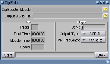
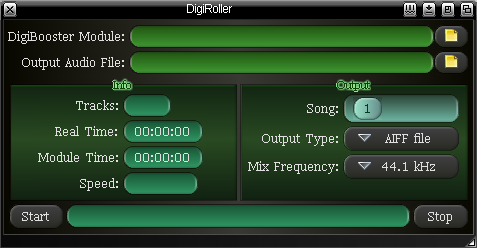
| − | MUI offers a dynamic layout as | + | MUI offers a dynamic layout as it's basic mode of operation. The placement of gadgets is determined by grouping them in horizontal, vertical or matrix groups. Pixel coordinates of gadgets adapt dynamically to user preferences like font sizes, spacing between gadgets, objects' frames and backgrounds. The two screenshots below show '''the same''' example application. The only difference is that user MUI settings are different. |
| Line 10: | Line 10: | ||
| − | The first settings are plain and clean. They may be | + | The first settings are plain and clean. They may even be called a bit oldschool for using simple, vector frames and uniform color backgrounds. A simple window skin, named ''Mahalaxmi'' fits this design nicely. |
| Line 16: | Line 16: | ||
| − | The second example uses some MUI 4 features, like bitmap frames with transparency masks. This dark design is | + | The second example uses some MUI 4 features, like bitmap frames with transparency masks. This dark design is achieved by using the ''Nox'' window skin. All gadget position calculations are done automatically, accounting for a larger font and fancy frames. The programmer need not care about user taste and preferences (a good programmer would test the program appearance with a few different settings however). |
==The First Steps== | ==The First Steps== | ||
Revision as of 21:58, 4 November 2010
Grzegorz Kraszewski
Introduction
Magic User Interface (MUI for short) is the MorphOS toolkit for creating applications with a graphical user interface. It provides a broad set of gadgets (controls) as well as a complete framework for designing event driven programs. MUI is object oriented, but does not rely on any specific programming language. A BOOPSI (Basic Object Oriented System for Intuition) is used as the foundation of MUI object oriented design.
MUI offers a dynamic layout as it's basic mode of operation. The placement of gadgets is determined by grouping them in horizontal, vertical or matrix groups. Pixel coordinates of gadgets adapt dynamically to user preferences like font sizes, spacing between gadgets, objects' frames and backgrounds. The two screenshots below show the same example application. The only difference is that user MUI settings are different.
The first settings are plain and clean. They may even be called a bit oldschool for using simple, vector frames and uniform color backgrounds. A simple window skin, named Mahalaxmi fits this design nicely.
The second example uses some MUI 4 features, like bitmap frames with transparency masks. This dark design is achieved by using the Nox window skin. All gadget position calculations are done automatically, accounting for a larger font and fancy frames. The programmer need not care about user taste and preferences (a good programmer would test the program appearance with a few different settings however).
The First Steps
- Short BOOPSI Overview
- Event Driven Programming, Notifications
- "Hello world!" in MUI

